定义基本样式
1
2
3
4
5
6
7
8
9
10
11
12
13
| * {
margin: 0;
padding: 0;
box-sizing: border-box;
font-family: "fangsong";
}
body {
height: 100vh;
display: flex;
align-items: center;
justify-content: center;
background-color: rgb(0, 0, 0);
}
|
font-family: ‘fangsong’; 仿宋字体。 display: flex; align-items: center; justify-content: center; flex布局,让按钮在屏幕居中。
定义基本标签
1
2
3
4
5
6
7
8
9
10
11
12
13
14
15
16
17
18
19
20
21
| <a href="#" class="item item1">
aurora
<span></span>
<span></span>
<span></span>
<span></span>
</a>
<a href="#" class="item item2">
aurora
<span></span>
<span></span>
<span></span>
<span></span>
</a>
<a href="#" class="item item3">
aurora
<span></span>
<span></span>
<span></span>
<span></span>
</a>
|
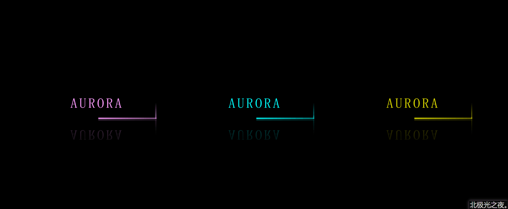
3个a标签就对应3个按钮,每个按钮里4个span就是环绕按钮的4条边。 且都有个公共的选择器 .item 和 只属于自己的选择器。
定义每个按钮的基本样式
1
2
3
4
5
6
7
8
9
10
11
12
13
14
15
| .item {
position: relative;
margin: 50px;
width: 300px;
height: 80px;
text-align: center;
line-height: 80px;
text-transform: uppercase;
text-decoration: none;
font-size: 35px;
letter-spacing: 5px;
color: aqua;
overflow: hidden;
-webkit-box-reflect: below 1px linear-gradient(transparent, rgba(6, 133, 133, 0.3));
}
|
text-align: center;文字对齐方式。
line-height: 80px; 字行高。
text-transform: uppercase; 字母为大写。
text-decoration: none; 去掉a标签默认下划线。
letter-spacing: 5px; 每个字符间的距离。
overflow: hidden;溢出隐藏。
-webkit-box-reflect: below 1px linear-gradient( transparent,rgba(6, 133, 133,0.3)); 这个属性能实现倒影效果。
鼠标经过按钮样式改变
1
2
3
4
5
6
7
8
| .item:hover {
background-color: aqua;
box-shadow:
0 0 5px aqua,
0 0 75px aqua,
0 0 155px aqua;
color: black;
}
|
box-shadow:0 0 5px aqua, 0 0 75px aqua, 0 0 155px aqua; 阴影,写多行可以叠加更亮。
设置环绕按钮的4根线上面那条的样式
1
2
3
4
5
6
7
8
9
10
11
12
13
14
15
16
17
| .item span:nth-of-type(1) {
position: absolute;
left: -100%;
width: 100%;
height: 3px;
background-image: linear-gradient(to left, aqua, transparent);
animation: shang 1s linear infinite;
}
@keyframes shang {
0% {
left: -100%;
}
50%,
100% {
left: 100%;
}
}
|
position: absolute;
left: -100%; 定位在对应位置。
background-image: linear-gradient(to left,aqua ,transparent); 线性渐变颜色。
animation: shang 1s linear infinite; 动画属性,让它动起来。
以此类推,设置环绕按钮的其它3根样式
1
2
3
4
5
6
7
8
9
10
11
12
13
14
15
16
17
18
19
20
21
22
23
24
25
26
27
28
29
30
31
32
33
34
35
36
37
38
39
40
41
42
43
44
45
46
47
48
49
50
51
52
53
54
55
56
57
| .item span:nth-of-type(2) {
position: absolute;
top: -100%;
right: 0;
width: 3px;
height: 100%;
background-image: linear-gradient(to top, aqua, transparent);
animation: you 1s linear infinite;
animation-delay: 0.25s;
}
@keyframes you {
0% {
top: -100%;
}
50%,
100% {
top: 100%;
}
}
.item span:nth-of-type(3) {
position: absolute;
right: -100%;
bottom: 0;
width: 100%;
height: 3px;
background-image: linear-gradient(to right, aqua, transparent);
animation: xia 1s linear infinite;
animation-delay: 0.5s;
}
@keyframes xia {
0% {
right: -100%;
}
50%,
100% {
right: 100%;
}
}
.item span:nth-of-type(4) {
position: absolute;
bottom: -100%;
left: 0;
width: 3px;
height: 100%;
background-image: linear-gradient(to bottom, aqua, transparent);
animation: zuo 1s linear infinite;
animation-delay: 0.75s;
}
@keyframes zuo {
0% {
bottom: -100%;
}
50%,
100% {
bottom: 100%;
}
}
|
animation-delay: 0.75s; 动画延迟执行。每条线对应延迟一段时间,形成时间差,形成环绕效果。
完整代码
1
2
3
4
5
6
7
8
9
10
11
12
13
14
15
16
17
18
19
20
21
22
23
24
25
26
27
28
29
30
31
32
33
34
35
36
37
38
39
40
41
42
43
44
45
46
47
48
49
50
51
52
53
54
55
56
57
58
59
60
61
62
63
64
65
66
67
68
69
70
71
72
73
74
75
76
77
78
79
80
81
82
83
84
85
86
87
88
89
90
91
92
93
94
95
96
97
98
99
100
101
102
103
104
105
106
107
108
109
110
111
112
113
114
115
116
117
118
119
120
121
122
123
124
125
126
127
128
129
130
131
132
133
134
135
136
137
138
139
140
141
142
143
144
145
146
147
148
149
150
| <!doctype html>
<html lang="zh-CN">
<head>
<meta charset="UTF-8" />
<meta http-equiv="X-UA-Compatible" content="IE=edge" />
<meta name="viewport" content="width=device-width, initial-scale=1.0" />
<title>Document</title>
<style>
* {
  margin: 0;
  padding: 0;
  box-sizing: border-box;
  font-family: "fangsong";
}
body {
  height: 100vh;
  display: flex;
  align-items: center;
  justify-content: center;
  background-color: rgb(0, 0, 0);
}
.item {
position: relative;
margin: 50px;
width: 300px;
height: 80px;
text-align: center;
line-height: 80px;
text-transform: uppercase;
text-decoration: none;
font-size: 35px;
letter-spacing: 5px;
color: aqua;
overflow: hidden;
-webkit-box-reflect: below 1px linear-gradient(transparent, rgba(6, 133, 133, 0.3));
}
.item:hover {
background-color: aqua;
box-shadow:
0 0 5px aqua,
0 0 75px aqua,
0 0 155px aqua;
color: black;
}
.item span:nth-of-type(1) {
position: absolute;
left: -100%;
width: 100%;
height: 3px;
background-image: linear-gradient(to left, aqua, transparent);
animation: shang 1s linear infinite;
}
@keyframes shang {
0% {
left: -100%;
}
50%,
100% {
left: 100%;
}
}
.item span:nth-of-type(2) {
position: absolute;
top: -100%;
right: 0;
width: 3px;
height: 100%;
background-image: linear-gradient(to top, aqua, transparent);
animation: you 1s linear infinite;
animation-delay: 0.25s;
}
@keyframes you {
0% {
top: -100%;
}
50%,
100% {
top: 100%;
}
}
.item span:nth-of-type(3) {
position: absolute;
right: -100%;
bottom: 0;
width: 100%;
height: 3px;
background-image: linear-gradient(to right, aqua, transparent);
animation: xia 1s linear infinite;
animation-delay: 0.5s;
}
@keyframes xia {
0% {
right: -100%;
}
50%,
100% {
right: 100%;
}
}
.item span:nth-of-type(4) {
position: absolute;
bottom: -100%;
left: 0;
width: 3px;
height: 100%;
background-image: linear-gradient(to bottom, aqua, transparent);
animation: zuo 1s linear infinite;
animation-delay: 0.75s;
}
@keyframes zuo {
0% {
bottom: -100%;
}
50%,
100% {
bottom: 100%;
}
}
.item1 {
filter: hue-rotate(100deg);
}
.item3 {
filter: hue-rotate(250deg);
}
</style>
</head>
<body>
<a href="#" class="item item1">
  aurora
  <span></span>
  <span></span>
  <span></span>
  <span></span>
</a>
<a href="#" class="item item2">
  aurora
  <span></span>
  <span></span>
  <span></span>
  <span></span>
</a>
<a href="#" class="item item3">
  aurora
  <span></span>
  <span></span>
  <span></span>
  <span></span>
</a>
</body>
</html>
|